
Accurately predicting the risk of mortality in hospitals and health care services is really important. However, biology is noisy and predictive models can easily incorporate noise instead of relevant information and work poorly outside its original data. Here, I’ll analyse a dataset with a few common hospital-related variables and death outcome in patients with heart failure.
First, let’s load the data and have a look at it. All this project was done using R.
library(ggplot2)
library(reshape2)
library(dplyr)
library(gridExtra)
library(tree)
library(smbinning)
library(kableExtra)

data <- read.csv("./heart_failure_clinical_records_dataset.csv")
summary(data)
##       age           anaemia       creatinine_phosphokinase    diabetes
##  Min.   :40.00   Min.   :0.0000   Min.   :  23.0           Min.   :0.0000
##  1st Qu.:51.00   1st Qu.:0.0000   1st Qu.: 116.5           1st Qu.:0.0000
##  Median :60.00   Median :0.0000   Median : 250.0           Median :0.0000
##  Mean   :60.83   Mean   :0.4314   Mean   : 581.8           Mean   :0.4181
##  3rd Qu.:70.00   3rd Qu.:1.0000   3rd Qu.: 582.0           3rd Qu.:1.0000
##  Max.   :95.00   Max.   :1.0000   Max.   :7861.0           Max.   :1.0000
##  ejection_fraction high_blood_pressure   platelets      serum_creatinine
##  Min.   :14.00     Min.   :0.0000      Min.   : 25100   Min.   :0.500
##  1st Qu.:30.00     1st Qu.:0.0000      1st Qu.:212500   1st Qu.:0.900
##  Median :38.00     Median :0.0000      Median :262000   Median :1.100
##  Mean   :38.08     Mean   :0.3512      Mean   :263358   Mean   :1.394
##  3rd Qu.:45.00     3rd Qu.:1.0000      3rd Qu.:303500   3rd Qu.:1.400
##  Max.   :80.00     Max.   :1.0000      Max.   :850000   Max.   :9.400
##   serum_sodium        sex            smoking            time
##  Min.   :113.0   Min.   :0.0000   Min.   :0.0000   Min.   :  4.0
##  1st Qu.:134.0   1st Qu.:0.0000   1st Qu.:0.0000   1st Qu.: 73.0
##  Median :137.0   Median :1.0000   Median :0.0000   Median :115.0
##  Mean   :136.6   Mean   :0.6488   Mean   :0.3211   Mean   :130.3
##  3rd Qu.:140.0   3rd Qu.:1.0000   3rd Qu.:1.0000   3rd Qu.:203.0
##  Max.   :148.0   Max.   :1.0000   Max.   :1.0000   Max.   :285.0
##   DEATH_EVENT
##  Min.   :0.0000
##  1st Qu.:0.0000
##  Median :0.0000
##  Mean   :0.3211
##  3rd Qu.:1.0000
##  Max.   :1.0000
Ok, so there are 12 variables, the outcome (“DEATH_EVENT”) and 299 observations. Let’s build a correlation matrix between all variables to explore very roughly any possible associations.
data$DEATH_EVENT <- as.factor(data$DEATH_EVENT)
data$anaemia <- as.factor(data$anaemia)
data$diabetes <- as.factor(data$diabetes)
data$high_blood_pressure <- as.factor(data$high_blood_pressure)
data$smoking <- as.factor(data$smoking)
data$sex <- factor(data$sex, labels = c("female", "male"))

corr_matrix <- round(cor(data.matrix(data), method = "spearman"),2)

# Get lower triangle of the correlation matrix
get_lower_tri<-function(cormat){
  cormat[upper.tri(cormat)] <- NA
  return(cormat)
}
# Get upper triangle of the correlation matrix
get_upper_tri <- function(cormat){
  cormat[lower.tri(cormat)]<- NA
  return(cormat)
}

upper_tri <- get_upper_tri(corr_matrix)
melted_matrix <- melt(upper_tri)

ggheatmap <- ggplot(melted_matrix, aes(Var2, Var1, fill = value)) +
  geom_tile(color = "white") +
  scale_fill_gradient2(low = "blue", high = "red", mid = "white",
                       midpoint = 0, limit = c(-1,1), space = "Lab",
                       name="Spearman\nCorrelation", na.value = "white") +
  theme_minimal() +
  theme(axis.text.x = element_text(angle = 45, vjust = 1,
                                   size = 12, hjust = 1)) +
  coord_fixed() +
  theme(
    axis.title.x = element_blank(),
    axis.title.y = element_blank(),
    panel.grid.major = element_blank(),
    panel.border = element_blank(),
    panel.background = element_blank(),
    axis.ticks = element_blank()) +
  ggtitle("Correlation matrix")

show(ggheatmap)
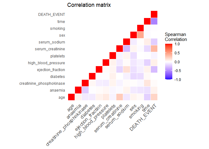
Time is the variable with the highest correlation to the outcome. This is a good time to actually understand how the data was generated. In the original study, it is described that time is the follow-up period available (in days) for each patient. Thus, if the follow-up period is too small, the patient may have already died after the follow-up period. Let’s have a look at the distribution of the follow-up time by outcome:
ggplot(data = data, aes(x = time, fill = DEATH_EVENT, color = DEATH_EVENT)) + geom_density(alpha = 0.5) + theme_minimal() + theme(axis.title = element_text(size=14), axis.text = element_text(size = 12)) + ylab("Density") + xlab("Follow-up time (days)")
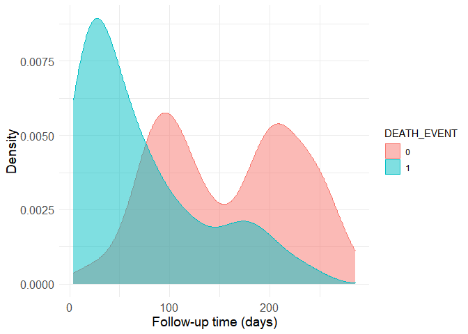
Now it is easy to see why the correlation is strong. The group with the death outcome (represented as a 1 in the dataset) presents much shorter follow-up time, presumably because most of them unfortunately die soon after their first hospital visit. Still, there are patients without the death outcome to whom little follow-up time is available. This is a problem because we can’t know if these people have really survived or if they actually died after the avaible (short) follow-up period. Thus, the data should be filtered to remove small follow-up times in the non-death group. The boundry here is of course arbitrary, as more stringent criteria provide more accurate data to begin with, but smaller sample sizes when the starting sample size is already quite limited. I’ve decided to use the 80th quantile of the follow-up time in the death group as a cutoff.
quantile(filter(data, DEATH_EVENT == 1)$time, 0.8)
## 80%
## 126
Let’s build a new density histogram of the non-death group and shade the excluded region.
histogram <- ggplot(data = filter(data, DEATH_EVENT != TRUE), aes(x = time)) + geom_density(alpha = 0.5, fill = "red", color = "red") + theme_minimal() + theme(axis.title = element_text(size=14), axis.text = element_text(size = 12)) + geom_vline(xintercept = 126, alpha = 0.5, size = 1)
d <- ggplot_build(histogram)$data[[1]]

histogram <- histogram + geom_area(data = subset(d, x < 126), aes(x=x, y=y), fill="#8b0000", alpha = 0.5) + ylab("density")
show(histogram)
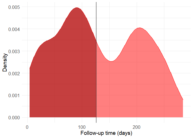
filtered_data <- filter(data, DEATH_EVENT == 1 | time > 126)
It might seem a bit drastic, but including these observations can distort predictive model quite a lot because of the way by which the data was generated. Also, the follow-up time cannot be used as a predictor because this variable in only available a posteriori, that is, after the follow-up period and therefore after most deaths occured. From now on, let’s work with this new filtered dataset and without using the time variable as a predictor. The original study analyses the data though survival curves, reinforcing this interpretation.
Now, with this new dataset, let’s look at the continuous variables comparing the two outcomes.
p_sodium <- ggplot(data = filtered_data, aes(DEATH_EVENT, serum_sodium, fill = DEATH_EVENT)) + geom_boxplot() + theme_bw() + theme(legend.position = "none") + xlab("Death") + ylab("Serum Sodium") + theme(panel.grid.major = element_blank(), panel.grid.minor = element_blank(), panel.background = element_blank(), axis.line = element_line(colour = "black"))

p_creatinine <- ggplot(data = filtered_data, aes(DEATH_EVENT, serum_creatinine, fill = DEATH_EVENT)) + geom_boxplot() + theme_bw() + theme(legend.position = "none") + xlab("Death") + ylab("Serum Creatinine") + theme(panel.grid.major = element_blank(), panel.grid.minor = element_blank(), panel.background = element_blank(), axis.line = element_line(colour = "black"))

p_platelets <- ggplot(data = filtered_data, aes(DEATH_EVENT, platelets, fill = DEATH_EVENT)) + geom_boxplot() + theme_bw() + theme(legend.position = "none") + xlab("Death") + ylab("Platelets") + theme(panel.grid.major = element_blank(), panel.grid.minor = element_blank(), panel.background = element_blank(), axis.line = element_line(colour = "black"))

p_ejection <- ggplot(data = filtered_data, aes(DEATH_EVENT, ejection_fraction, fill = DEATH_EVENT)) + geom_boxplot() + theme_bw() + theme(legend.position = "none") + xlab("Death") + ylab("Ejection Fraction") + theme(panel.grid.major = element_blank(), panel.grid.minor = element_blank(), panel.background = element_blank(), axis.line = element_line(colour = "black"))

p_cpk <- ggplot(data = filtered_data, aes(DEATH_EVENT, creatinine_phosphokinase, fill = DEATH_EVENT)) + geom_boxplot() + theme_bw() + theme(legend.position = "none") + xlab("Death") + ylab("Creatinine Phosphokinase") + theme(panel.grid.major = element_blank(), panel.grid.minor = element_blank(), panel.background = element_blank(), axis.line = element_line(colour = "black"))

p_age <- ggplot(data = filtered_data, aes(DEATH_EVENT, age, fill = DEATH_EVENT)) + geom_boxplot() + theme_bw() + theme(legend.position = "none") + xlab("Death") + ylab("Age") + theme(panel.grid.major = element_blank(), panel.grid.minor = element_blank(), panel.background = element_blank(), axis.line = element_line(colour = "black"))

grid.arrange(p_age, p_creatinine, p_cpk, p_ejection, p_platelets, p_sodium, nrow = 2)
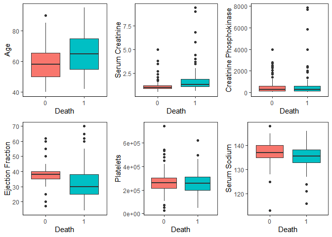
We can see that age, serum creatinine, ejection fraction and serum sodium show noticeable differences in distribution between the two outcomes.
Building a predictive model: logistic reggression
When building a predictive model, we always have to be cautious about its complexity and the signal-to-noise ratio in the original data. In this case - biomedical data from patients - there’s usually a lot of noise. This noise comes from biological variability (which is already pretty high) combined with measuring and human errors. So, biomedical data can be quite a needle-in-the-hasting situation: the signal is there, but surrounded by a lot of noise. Therefore, the predictive model should be as simple as possible. Trying to add too much complexity will easily cause overfitting and decrease the generalization capacity of the model. That is, it will work really well with this dataset, but poorly with others. Moreover, there are less than 300 observations, which also limits the complexity of the model.
Logistic regression is a type of generalized linear model that is quite useful to predict categorical outcomes like ours. Since it’s a linear model, it can be kept simple it’s a quite interpretable. Let’s build one with all predictors:
log_reg <- glm(data = filtered_data, DEATH_EVENT ~ age + anaemia + creatinine_phosphokinase + diabetes + ejection_fraction + high_blood_pressure + serum_creatinine + serum_sodium + sex + smoking, family = "binomial")

summary(log_reg)
##
## Call:
## glm(formula = DEATH_EVENT ~ age + anaemia + creatinine_phosphokinase +
##     diabetes + ejection_fraction + high_blood_pressure + serum_creatinine +
##     serum_sodium + sex + smoking, family = "binomial", data = filtered_data)
##
## Deviance Residuals:
##     Min       1Q   Median       3Q      Max
## -2.6772  -0.8397  -0.4011   0.8884   2.4091
##
## Coefficients:
##                            Estimate Std. Error z value Pr(>|z|)
## (Intercept)               2.9584921  5.1159428   0.578 0.563069
## age                       0.0541167  0.0147177   3.677 0.000236 ***
## anaemia1                  0.9280712  0.3518475   2.638 0.008347 **
## creatinine_phosphokinase  0.0003715  0.0001809   2.053 0.040046 *
## diabetes1                 0.0310352  0.3359719   0.092 0.926401
## ejection_fraction        -0.0602175  0.0166305  -3.621 0.000294 ***
## high_blood_pressure1      0.7145341  0.3591042   1.990 0.046616 *
## serum_creatinine          0.9299890  0.2865249   3.246 0.001171 **
## serum_sodium             -0.0468141  0.0373333  -1.254 0.209860
## sexmale                  -0.1612479  0.3962186  -0.407 0.684032
## smoking1                 -0.0055385  0.3925579  -0.014 0.988743
## ---
## Signif. codes:  0 '***' 0.001 '**' 0.01 '*' 0.05 '.' 0.1 ' ' 1
##
## (Dispersion parameter for binomial family taken to be 1)
##
##     Null deviance: 292.0  on 211  degrees of freedom
## Residual deviance: 223.4  on 201  degrees of freedom
## AIC: 245.4
##
## Number of Fisher Scoring iterations: 5
Building models tailored to its application
Six variables were significant predictors of mortality in the logistic regression. Although we could refine this model and achieve a good accuracy, it’s not convenient to be used in a point of care fashion. Realistically, depending on a computer-powered algorithm to assess risk in a hospital setting is still not convenient in most places. A more suited model would give the prediction without the need of computers.
Decision trees fit this requirement. They split the data in branches assigning cutoff values to each variable trying to maximize the outcome prediction. In other words, it generates a flowchart-like structure that can be easily followed by humans.
Let’s split the data between training and test subsets, as trees can easily overfit, build a big one and then use cross-validation to prune the tree as short as possible while retaining good accuracy.
set.seed(42)

train <- sample(1:nrow(filtered_data), 148)
tree <- tree(DEATH_EVENT ~ . -time, filtered_data, subset = train)
cv_tree <- cv.tree(tree, FUN = prune.misclass)

plot(cv_tree)
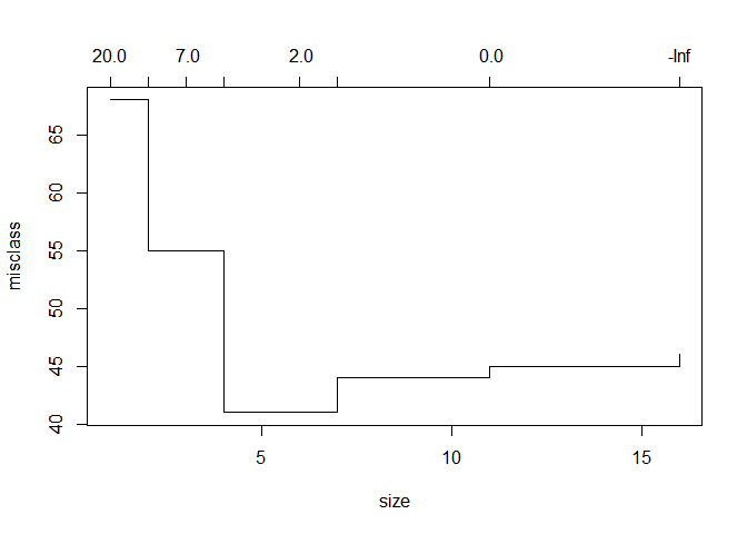
With a depth of just 4 branches, we achieve peak accuracy. This is how the tree looks like:
prune_tree <- prune.misclass(tree, best = 4)
plot(prune_tree)
text(prune_tree)
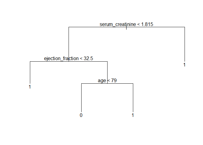
Let’s use this model to predict the outcome in the test subset of data and draw a table with the results.
tree_pred = predict(prune_tree, filtered_data[-train, ], type = "class")
with(filtered_data[-train, ], table(tree_pred, DEATH_EVENT))
##          DEATH_EVENT
## tree_pred  0  1
##         0 24  6
##         1  8 26
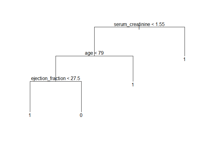
Here, the model achieved 71.8% accuracy in the test subset. It’s quite good, but decision trees can vary drastically just by changing the data a tiny bit. This can be demonstrated by changing the random seed and selection a new subset of training data. This is another possible tree:
set.seed(71)

train <- sample(1:nrow(filtered_data), 148)
tree <- tree(DEATH_EVENT ~ . -time, filtered_data, subset = train)
cv_tree <- cv.tree(tree, FUN = prune.misclass)
prune_tree <- prune.misclass(tree, best = 4)
plot(prune_tree)
text(prune_tree)
Making it simpler: building a score
The decision tree would already be reasonably accurate and easy to implement inside hospitals. Still, as the last example shows, the hierarchy between the predictors can change just with tiny variations in the data. With under 300 observations and noisy data, we risk building noise into the model by setting a hierarchy between predictors.
An alternative is using a scoring system. The health system already makes extensive use of them with notable success (e.g. the Apgar score or the NIH stroke scale). To build a score, we’ll use the smbinning package to divide continuous variables into categorical ones. Then, these variables will be used as predictors to assign score points related to the outcome. This package uses recursive partitioning, that is, it builds a decision-tree-like structure for each variable to find which splitting points maximize their outcome predictive power. Let’s bin the continuous variables (not all of them will have significant binning points) and build a new logistic reggression with them.
num_filtered_data <- filtered_data
num_filtered_data$DEATH_EVENT <- as.numeric(num_filtered_data$DEATH_EVENT) - 1

is_num_variables <- sapply(filtered_data, is.numeric)
num_variables <- colnames(filtered_data)[is_num_variables]

new_variables <- vector()

for (i in num_variables){
  binning = smbinning(num_filtered_data, "DEATH_EVENT", i, p = 0.1)
  if (!is.character(binning)){
    name <- paste(i, "bin", sep = "_")
    num_filtered_data <- smbinning.gen(num_filtered_data, binning, name)
    new_variables <- append(new_variables, name)
  }
}

scoring_vars <- c(colnames(filtered_data)[!is_num_variables][-5], new_variables[-5])

bin_reg <- glm(data = num_filtered_data, as.factor(DEATH_EVENT) ~ anaemia + diabetes + high_blood_pressure + sex + smoking + age_bin + ejection_fraction_bin + serum_creatinine_bin + serum_sodium_bin, family = "binomial")

summary(bin_reg)
##
## Call:
## glm(formula = as.factor(DEATH_EVENT) ~ anaemia + diabetes + high_blood_pressure +
##     sex + smoking + age_bin + ejection_fraction_bin + serum_creatinine_bin +
##     serum_sodium_bin, family = "binomial", data = num_filtered_data)
##
## Deviance Residuals:
##     Min       1Q   Median       3Q      Max
## -2.3225  -0.7347  -0.4139   0.7564   2.2443
##
## Coefficients:
##                               Estimate Std. Error z value   Pr(>|z|)
## (Intercept)                     0.2264     0.8607   0.263   0.792560
## anaemia1                        0.7040     0.3579   1.967   0.049156 *
## diabetes1                      -0.0442     0.3671  -0.120   0.904164
## high_blood_pressure1            0.6549     0.3775   1.735   0.082779 .
## sexmale                        -0.1711     0.4098  -0.418   0.676282
## smoking1                       -0.1955     0.4199  -0.466   0.641475
## age_bin02 > 70                  1.2665     0.4629   2.736   0.006226 **
## ejection_fraction_bin02 <= 30  -1.3169     0.7688  -1.713   0.086709 .
## ejection_fraction_bin03 > 30   -2.6608     0.7370  -3.611   0.000306 ***
## serum_creatinine_bin02 <= 1.8   1.0863     0.4649   2.337   0.019460 *
## serum_creatinine_bin03 > 1.8    3.0255     0.6606   4.580 0.00000466 ***
## serum_sodium_bin02 > 135       -0.1611     0.3861  -0.417   0.676574
## ---
## Signif. codes:  0 '***' 0.001 '**' 0.01 '*' 0.05 '.' 0.1 ' ' 1
##
## (Dispersion parameter for binomial family taken to be 1)
##
##     Null deviance: 292.00  on 211  degrees of freedom
## Residual deviance: 204.99  on 200  degrees of freedom
## AIC: 228.99
##
## Number of Fisher Scoring iterations: 5
We now rebuild the model using only significant predictors.
num_filtered_data$ejection_fraction_bin <- factor(num_filtered_data$ejection_fraction_bin, levels = c("03 > 30", "02 <= 30", "01 <= 20"))

bin_reg <- glm(data = num_filtered_data, as.factor(DEATH_EVENT) ~ anaemia + age_bin + ejection_fraction_bin + serum_creatinine_bin, family = "binomial")

summary(bin_reg)
##
## Call:
## glm(formula = as.factor(DEATH_EVENT) ~ anaemia + age_bin + ejection_fraction_bin +
##     serum_creatinine_bin, family = "binomial", data = num_filtered_data)
##
## Deviance Residuals:
##     Min       1Q   Median       3Q      Max
## -2.0220  -0.7343  -0.3965   0.9449   2.2726
##
## Coefficients:
##                               Estimate Std. Error z value    Pr(>|z|)
## (Intercept)                    -2.5037     0.4741  -5.281 0.000000129 ***
## anaemia1                        0.6873     0.3479   1.976    0.048178 *
## age_bin02 > 70                  1.3331     0.4429   3.010    0.002616 **
## ejection_fraction_bin02 <= 30   1.3307     0.3942   3.376    0.000735 ***
## ejection_fraction_bin01 <= 20   2.6506     0.7040   3.765    0.000167 ***
## serum_creatinine_bin02 <= 1.8   1.0581     0.4545   2.328    0.019895 *
## serum_creatinine_bin03 > 1.8    3.0097     0.6298   4.779 0.000001763 ***
## ---
## Signif. codes:  0 '***' 0.001 '**' 0.01 '*' 0.05 '.' 0.1 ' ' 1
##
## (Dispersion parameter for binomial family taken to be 1)
##
##     Null deviance: 292.00  on 211  degrees of freedom
## Residual deviance: 209.24  on 205  degrees of freedom
## AIC: 223.24
##
## Number of Fisher Scoring iterations: 5
The scaling function of the smbinning package assigns score points to each variable. I have toyed a bit with the parameters to come up with a convenient scale of points.
scaled_reg <- smbinning.scaling(bin_reg, pdo = 10, score = 100, odds = 95)
scaled_reg$logitscaled[[1]] %>% kbl() %>% kable_styling()
| Characteristic | Attribute | Coefficient | Weight | WeightScaled | Points |
|---|---|---|---|---|---|
| (Intercept) | -2.5036549 | -36.120105 | 0.0000000 | 0 | |
| anaemia0 | 0 | 0.0000000 | 0.000000 | -0.4546653 | 0 |
| anaemia1 | 1 | 0.6873409 | 9.916232 | 9.4615672 | 9 |
| age\_bin | 01 <= 70 | 0.0000000 | 0.000000 | -0.4546653 | 0 |
| age\_bin | 02 > 70 | 1.3330850 | 19.232351 | 18.7776857 | 19 |
| ejection\_fraction\_bin | 01 <= 20 | 2.6505543 | 38.239416 | 37.7847509 | 38 |
| ejection\_fraction\_bin | 02 <= 30 | 1.3307333 | 19.198423 | 18.7437577 | 19 |
| ejection\_fraction\_bin | 03 > 30 | 0.0000000 | 0.000000 | -0.4546653 | 0 |
| serum\_creatinine\_bin | 01 <= 0.9 | 0.0000000 | 0.000000 | -0.4546653 | 0 |
| serum\_creatinine\_bin | 02 <= 1.8 | 1.0581401 | 15.265735 | 14.8110702 | 15 |
| serum\_creatinine\_bin | 03 > 1.8 | 3.0096960 | 43.420735 | 42.9660696 | 43 |
Let’s divide the points and round them to a single digit to make the model even simpler.
points <- round(scaled_reg$logitscaled[[1]][ , "Points"]/10, 0)
names(points) <- scaled_reg$logitscaled[[1]][ , "Characteristic"]
points
##           (Intercept)              anaemia0              anaemia1
##                     0                     0                     1
##               age_bin               age_bin ejection_fraction_bin
##                     0                     2                     4
## ejection_fraction_bin ejection_fraction_bin  serum_creatinine_bin
##                     2                     0                     0
##  serum_creatinine_bin  serum_creatinine_bin
##                     2                     4
Lastly, I’ve chosen to make it simpler one last time by eliminating the anaemia variable. Then, all other points can be divided by 2. This creates a very simple scoring system ranging from 0 to 5 points. A higher score means a higher mortality risk. Finally, we create a function to obtain such score from patient data and calculate some accuracy metrics using this scoring method.
get_score <- function(data){
  scores = vector()
  for (i in 1:nrow(data)){
    score = 0
    if (data[i, "age"] > 70){
      score = score + 1
    }
    if (data[i, "ejection_fraction"] <= 20){
      score = score + 1
    }
    if (data[i, "ejection_fraction"] <= 30){
      score = score + 1
    }
    if (data[i, "serum_creatinine"] > 0.9){
      score = score + 1
    }
    if (data[i, "serum_creatinine"] > 1.8){
      score = score + 1
    }
    scores <- append(scores, score)
  }
  return(scores)
}

scores <- get_score(filtered_data)
num_filtered_data$score <- scores
smbinning.metrics(prediction = "score", actualclass = "DEATH_EVENT", dataset = num_filtered_data)
##
##   Overall Performance Metrics
##   --------------------------------------------------
##                     KS : 0.6038 (Awesome)
##                    AUC : 0.8222 (Good)
##
##   Classification Matrix
##   --------------------------------------------------
##            Cutoff (>=) : 2 (Optimal)
##    True Positives (TP) : 77
##   False Positives (FP) : 23
##   False Negatives (FN) : 19
##    True Negatives (TN) : 93
##    Total Positives (P) : 96
##    Total Negatives (N) : 116
##
##   Business/Performance Metrics
##   --------------------------------------------------
##       %Records>=Cutoff : 0.4717
##              Good Rate : 0.7700 (Vs 0.4528 Overall)
##               Bad Rate : 0.2300 (Vs 0.5472 Overall)
##         Accuracy (ACC) : 0.8019
##      Sensitivity (TPR) : 0.8021
##  False Neg. Rate (FNR) : 0.1979
##  False Pos. Rate (FPR) : 0.1983
##      Specificity (TNR) : 0.8017
##        Precision (PPV) : 0.7700
##   False Discovery Rate : 0.2300
##     False Omision Rate : 0.1696
##   Inv. Precision (NPV) : 0.8304
##
##   Note: 0 rows deleted due to missing data.
The model has achieved 80.19% accuracy, which is quite impressive considering its numeric simplicity. A score of 2 or more points is considered high mortality risk. This goes to show the importance of keeping it simple when building predictive models with noisy data and small datasets. In this case, we simplified it to the extreme to improve generalization and avoid overfitting.
| Variables | Points |
|---|---|
| Age | |
| Age > 70 | +1 |
| Ejection fraction | |
| Ejection fraction <= 30% | +1 |
| Ejection fraction <= 20% | +2 |
| Serum creatinine | |
| Serum creatinine > 0.9 mg/dL | +1 |
| Serum creatinine > 1.8 mg/dL | +2 |
With just 3 easily-available variables this scoring model achieves 80.21% sensitivity and 80.17% specificity while also being so simple that it can be calculated mentally be healthcare workers. Still, it’s not immune from overfitting: the binning boundaries may have incorporated noise and a larger dataset would be helpful to fine tune them.
This is a representation of the final model:
Leave a comment